Travelwise Rebranding
Role: Art Director / Creative Director / Graphic Designer
At BUILT, we had the unique opportunity to inherit a line of packing cubes from our parent company, Lifetime Brands. After reviewing the current logo and pattern assortment, we felt that it would be much easier to start from scratch and give the brand a visual rebranding.
The Approach
Starting fresh, we wanted to develop a modern-looking logo that fit into the packing cube space. Pulling in a royal blue, which based in color theory, reinforces safety. Removing the crossbar from the letter “A” led to the visual of two arrows pointing in different directions, implying movement. We ran with this and developed a pattern with the arrows pointing in different directions.
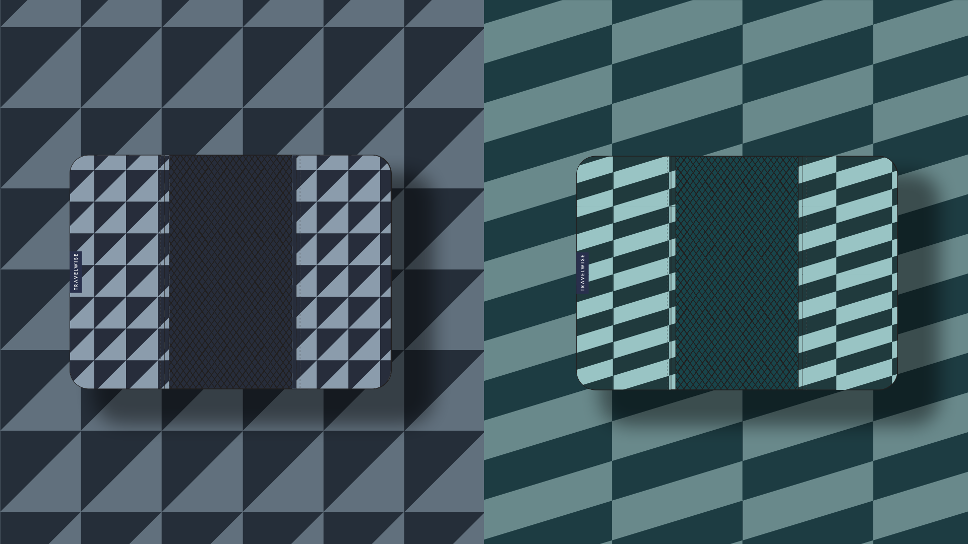
For the patterns, we took the same approach as we did for our soft good, (lunch bag, welded coolers, etc.) pattern designs. Knowing that these were both going to live on Amazon and big box stores, we wanted to keep the patterns simple and unoffensive. Based on the trend research and competitive analysis we previously pulled for the year, we developed a unique product color / pattern assortment.
The Result
The final outcome resulted in a re-invigorated product assortment and visual aesthetic that aligned with the latest trends and was able to become a formidable competitor in the space.


